Tuesday, September 28, 2010

Notes from Sept. 27 meeting.

Friends,

We started our meeting by discussing the themes we see in the present collection. Mara said that she saw identity in all the pieces as well as process -- particularly in the Meyers piece as well as the many layers of the Pinder installation.

David agreed that identity was present in all the pieces as well as the theme of perception, the way we view things. He added that even in the excavation photograph there is evidence of what is human-made.

Erin added that many of the pieces seems to deal with the permeability of cultural boundaries and ways in which we create our own identities. She also said that as a viewer, she initially looks for form and aesthetic considerations before theme, making the exercise particularly interesting to her.

Maya said that one of the hallmarks of contemporary art is the consideration of what the viewer brings to what she's looking at.

Eldis added that many of the current pieces address the question of technology and its effects. He agreed that cultural identity is another common theme, but added that perhaps the collection could better address gender and sexual identity.

Erin responded that many of the cultural identity pieces in the present collection have similar approaches, i.e. "I am not what you think I am."

David said he saw themes of assumption in a lot of the work.

Maya wondered about finding pieces that are deeply prideful of cultural identity, to which Erin responded with a few artists who are bringing together images from various cultures as means of celebrating cultural hybridity. She referenced a few specific artists and we spent some time looking at work by Yinka Shonibare, Lalla Essaydi, Kehinde Wiley, and Grace Ndiritu (see images below).
As a result of this discussion, we came up with the following themes to explore:
Gender/sexuality
Culture as hybridity
Discovery
Place/setting/location
Time/timeliness
Growth/journey/transformation
Art as a reference to the tradition of art
Identity formation
Environmentalism/organic movement/nature
Questioning authority
More overt political themes
How UMD's environment shapes students
Civic engagement
Social responsibility
UMD's involvement in the local community
Pieces exploring non-humanities disciplines (science, mathematics, etc.)
High culture vs. low culture
Religion
Religious diversity

Erin added that all the work in the collection is very cerebral and that there is very little work about work. "Contemporary art doesn't have to be ugly," she said.

David added that he is hoping for something three-dimensional in the collection, and Maya added that the presence of other genres would strengthen the collection overall.


Yinka Shonibare


Lalla Essaydi


Kehinde Wiley


Grace Ndiritu

Monday, September 27, 2010

Shenandoah's themes.

Hi, folks,
In anticipation of tonight's meeting, I thought I'd post some themes I see in the present collection.
Best, see you soon,
Shenandoah

Edward Burtynsky
Environmentalism
Perspective/what is seen and unseen

Dulce Pinzon
Perception/what is seen and unseen
Culture as identity
Class/labor as identity

Annu Palakunnatthu Matthew
Perception/what is seen and unseen
Culture as identity
History as identity
Race as identity
Cultural assumptions

Barbara Probst
Perception/what is seen and unseen
Performativity

Linn Meyers
Perception/what is seen and unseen

Jefferson Pinder
Perception/what is seen and unseen
Cultural assumptions
Race as identity
Performativity
History

Sunday, September 12, 2010

StudioGallery: Jan Willem van der Vossen


About the gallery: "Studio Gallery showcases contemporary art in a variety of mediums, including painting, installation, sculpture, mixed media, and video. We represent over 35 artists, both American and International who live in the DC metropolitan area. Our artists exhibit in solo, duo, and group shows, as well as in special exhibitions at several local venues.


Located in the heart of Dupont Circle - near the Phillips Collection, Textile Museum, and Woodrow Wilson House -- we are a part of the Galleries of Dupont Circle, members of which participate in "First Friday openings. The openings are held throughout the year on the first Friday evening of every month, and allow the public to meet and spek with artists, curators, and other art enthusiasts in a single exciting night."
The image above is "Astral Chart," a collage and acrylic on canvas (40" x 40"). The work is by Jan Williem van der Vossen. This piece was grouped with some other of his works -- mostly floral and landscape paintings in acrylic. I enjoyed the other works for their fluidness and vibrant colors.
Astral Chart captured my attention because -- hard to see here -- many of the leaf shapes are cut out of images of clocks and the inner workings of clocks. I liked the juxtaposition of time & nature. The collage is primarily circular -- another representation of the time and nature concepts but the few bold, linear strokes made me think of the many ways that the natural cycle of time and nature can be disrupted. I don't recall any collages or many pieces in the Stamp collection that reflect nature. I believe this piece would be good to have just for that fact alone. However, I think that it is a work that has that "oh I get it" quality that a few of the works in a public collection should have.
Jan was at the gallery for opening and explained that he had been working on a series of nature inspired paintings and got bored. The collage gave him a chance to do something a tad different, yet continue with the nature theme. (PS: his florals on display were dynamic as well. They would make a nice juxtaposition to Astral Chart. Sorry, I don't have pictures of those. My tech who took photos is out and I can't figure out how to upload them!)


Saturday, September 11, 2010

Project 4 Gallery: Beau Chamberlain

Project 4 Gallery:
Project 4 Gallery is a rather new gallery in Washington D.C, just one block away from the U-Street Cardozo stop on the Green line.  The gallery focuses on contemporary art and design, with one-person shows and thematic exhibitions by emerging or mid-career artists. The gallery likes to be "open" by inviting guest curators to host exhibitions and also emphasizes recurring and emerging trends within contemporary art and design. The gallery hopes to remain a flexible space for art and ideas in all forms--whether it be installation, video, sculpture, site specific works, etc.-- spanning a range of cultural issues. 

http://www.project4gallery.com/index.html


Beau Chamberlain on his art work:
"The titles give my paintings a loose narrative structure that allows the viewer to piece together their interpretation of the scenes upon entering these environments unaware of whether they have just missed something or whether they are in the middle of some future action about to take place. At first, plant and animal life seem to be in a state of suspended animation, unable to break free of the vibrant, reverberating color of their atmosphere, but, at closer examination, the seemingly static landscapes reveal themselves: they are teeming with life. Undulating organic forms float through space, creating tension with one another and their environment. Hollow cocoons, empty trees and headless serpents are some of the recurring symbols of life and death, strength and instability, predator and prey. Nothing in these environments can be taken at face value. "

"all signs point to maybe." (2007)


"only a glimpse." (2007)


"breathing was the easy part."(2007)


"this is forever." (2007)


Thoughts:
So all of these are done with acrylic on panel, and I know paintings are generally more expensive to purchase...but the collection *definitely* needs them-- especially ones that will immediately catch the eye, and draw people in.

What I love about Beau Chamberlain's paintings is that he literally creates a dreamlike world of flora and fauna seemingly suspended in mid-air. When you look carefully, it is not a mere collage of images of botanical and entomological subjects tacked onto a bright background; it is a breathing, vibrant world that seems to be teeming with metaphorical representations of birth, life and death in a "place" that has no definitive time, location or scale. As stated in the artist's statement, nothing in nature can or should be taken at face value.

Also, I like how Beau Chamberlain does not allow viewers to be passive; the enigmatic titles provide a framework for viewers to guess or create a narrative.
I highly suggest you go to his website to view the images in larger format.

Wednesday, September 8, 2010

Hemphill Fine Arts: Max Hirshfeld

Hemphill Fine Arts
Hemphill is a commercial gallery on 14th St. in Logan Circle. Although it has only been there since its 2004 relocation, the gallery opened September of 1993 in Georgetown. Hemphill exhibits contemporary artwork ranging in media by up-and-coming, mid-career, and established artists. According to their website, they exhibit "historically significant artwork and socially relevant subjects... to showcase important talent and provide artwork appealing to a broad range of interests."

http://www.hemphillfinearts.com/

Max Hirshfeld
Max Hirshfeld is a professional photographer based in Washington, DC. There is no CV or mission statement on his website, and the information he gives is sparse, but he is nationally renowned, with recognition from, amongst others, American Photography and PDN.

www.maxpix.com

What I am particularly interested in, however, is his Looking at Looking series, which features photographs of people looking at artwork in the museum galleries of the National Gallery in DC.

Looking at Looking #19
Looking at Looking #2
Looking at Looking #92
Thoughts
Max Hirshfeld's series is interesting because it explores what it means to view and interact with art. Viewing art in a museum can be an intensely personal and transcendent experience, as he captures in the serene, harmonious moments of #19 and #2. However, he reminds us that looking at art is also very social and fun, intended not only for experts, but everyone--families, children, people of all ages and backgrounds. These photographs explore questions not only that the committee will have to address, but that Stamp visitors ask when they look at the art in the building. Why look at art? Who is it for? How should it be observed? The work is relevant to the Stamp because its mission to showcase more art throughout the building is in itself, like Hirshfeld's work, a meditation on what it means to experience art.

Saturday, September 4, 2010

Irvine Contemporary Art Gallery: Alexa Meade

The Irvine Gallery features work from early to mid-career artists as well as a select group of artists for the interested collectors. As a full service gallery they focus on assisting collectors from varying experiences. They also "provide art advising and consulting, art appraisals, private resales, and lectures and informational events on contemporary art, art collecting, and the art market"

Mission Statement: while the gallery has no explicitly written mission statement I gather from reading about the gallery and the various services they offer and highlight one of their main purposes is to provide a forum for artist who are not necessarily famous, but somewhat established to take their success to the next level. Along with this they provide full services for budding and experienced collectors. The gallery essentially brings together in a very successful way artists and collectors

ALEXA MEADE
A 23 year old artist living and working in DC


Artist Statement:
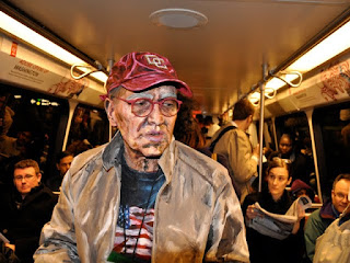
(taken from her website) "Meade’s approach to portraiture questions our understanding of the body and identity. Meade coats her models with a mask of paint, obscuring the body while intimately exposing it, creating an unflinchingly raw account of the person. The painted second skin perceptually dissolves the body into a 2D caricature. The subjects become art objects as they are transformed into re-interpretations of themselves. In turn, the models’ identities become altered by their newskin, embodying Meade’s dictated definition of their image to the viewer."


Thoughts:
Looking at this artist work at first glance may not seem that intriguing, perhaps just a well painted portrait. Looking closer you see that the portraits are actual live people painted to resemble 2D images.
What I like about this artists is that her work exists in different layers for the viewer to interact with. There is a sculptural element with the installation of a constructed room with a live person which actually invades the viewers space and forces some sort of interaction. There is a performance aspect of her work, which in a beautiful way exist ephemerally, the work only exist as long as the subject is a part of it. It is washed away and recreated in another setting with another model.
When I was looking at this piece I thought about what was said in the first meeting that the works in stamp largely dealt with the idea of identity in a way I think this work references it as well, not necessarily the artist identity, but a universal concept of identity..is it fleeting,constantly changing, evolving, and essentially recreating itself?


Friday, September 3, 2010

Zenith Gallery: Nora Sidoine-Brown

Zenith Gallery:
This gallery has been around for many years, and helped usher many of the local well renowned contemporary artists forward. They were founded by Margery E. Goldberg who is still receiving awards for the work she's doing.

Mission Statement:
To promote exceptional artists at all stages in their careers and to remain at the forefront of Washington area art.

Artist and Artistic Statement:
Nora Sidoine-Brown
Sidoine-Brown's primary training is in architectural design. She has taught herself how to produce wonderful pieces of glass art so she can explore human motion and how it interfaces with different environments and times of tension. Her work has a huge range in forms, but all clearly show their meaning.

David's Thoughts:
Good Stuff. She can just add a curve and change a color and she produces a different piece (as in the waltz pieces) and show us a different part of human interaction. And her pieces are wildly different. I'm stunned at how different, and yet overwhelming effective her flat panels are (At the Bar). Despite my glowing praise, I think her work is a little commercial. I feel almost as if I could see the waltz pieces at IKEA. Almost.